Sugar CRM Re-Architecture
Prodcut
Role
Year
Veteran Benefits Guide helps veterans file disability claims, and Sugar CRM is the internal web app used by employees to manage veterans and business clients, process claims, review documents, and collaborate with the team.
However, when Sugar was first launched, it was built without a designer’s input. The result? A frustrating, inefficient system that led to a near 50% drop in claim submissions and widespread dissatisfaction among employees. Users struggled with its complex navigation, buried information, and poor usability, leading to reduced productivity and frustration.
(This project focuses on the redesign of Sugar CRM’s Information Architecture to improve usability, streamline navigation, and ensure key information is easily accessible. My approach to role-based workflow optimization will be covered separately in the Sugar CRM Workflow Optimization project.)
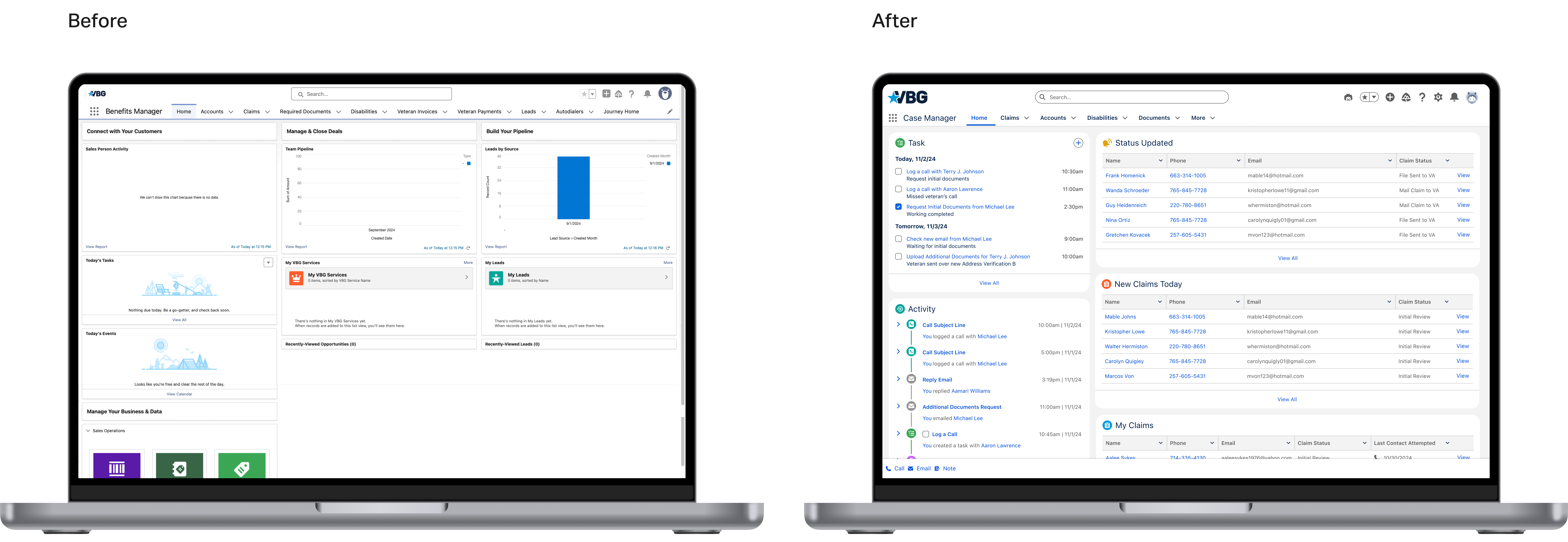
Design comparison
Major UX issues
To uncover how employees used Sugar in their daily work, I conducted user interviews and field studies with representatives from each role. I observed their workflows, the main tasks they performed, and the key features they relied on.
Issue Ⅰ: Misaligned and overcrowded navigation
• The navigation bar was cluttered with unnecessary links. All roles used the same menu, even if they didn’t need certain features.
• Nested pages lacked secondary navigation, making it hard to know where you were or go back easily.
• Features like Notes and Activity appeared in different places on different pages — sometimes more than once — causing confusion.
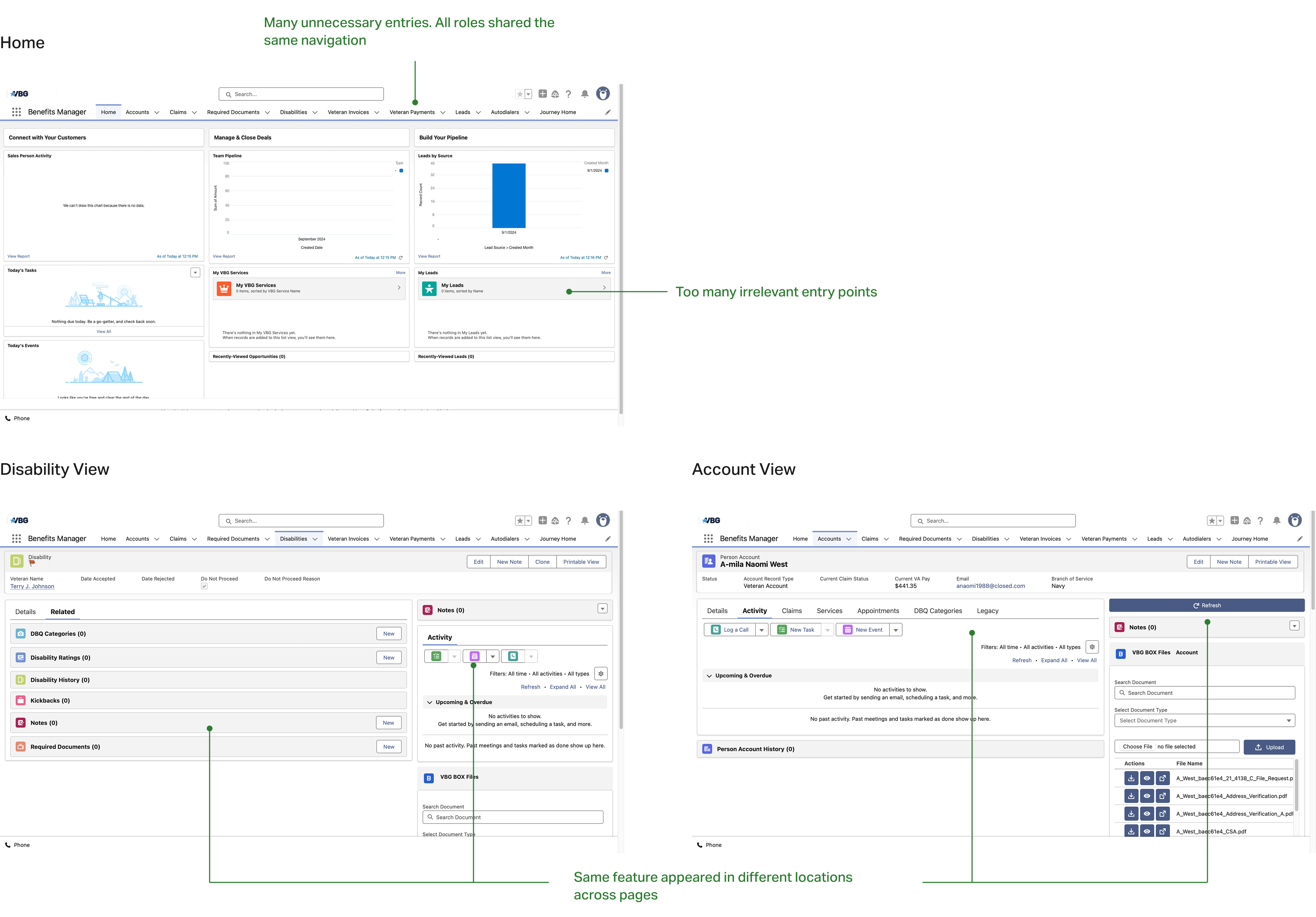
Issue Ⅱ: Deep page hierarchies
• Users had to go through 3–5 clicks to reach key information.
• Important pages were hidden in deep menus.
• Related information was spread across multiple pages, forcing constant switching.
• Key actions like file uploads were placed in different locations without clear structure.
• Redundant tabs and duplicated features led to frustration and confusion.

Issue Ⅲ: Low discoverability of key information
• Pages for claims, documents, and disabilities lacked basic information like file names or associated veteran names.
• Information wasn’t sorted logically, making it hard to quickly find what users needed.
• Important features, like file uploads, were hard to spot due to small buttons or poor placement.
Enhancing navigation
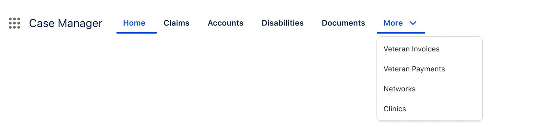
Prioritized navigation bar
The new navbar displays only the most frequently used links, while less common pages are moved into a “More” dropdown, reducing visual clutter.
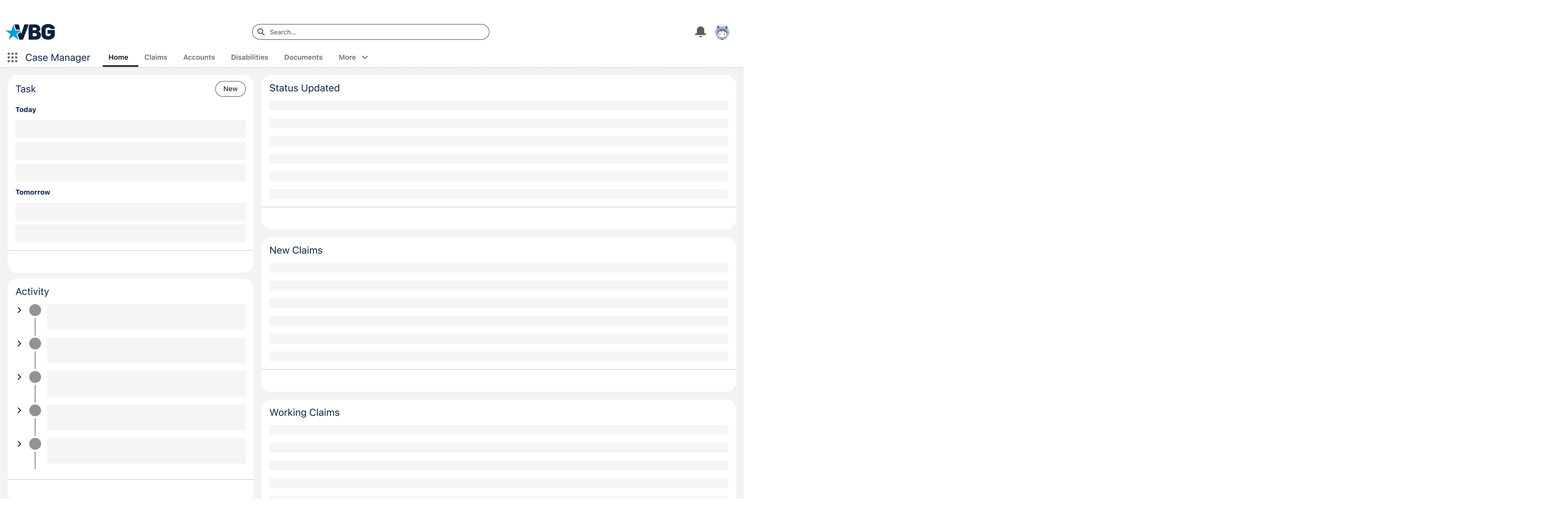
Homepage reorganization
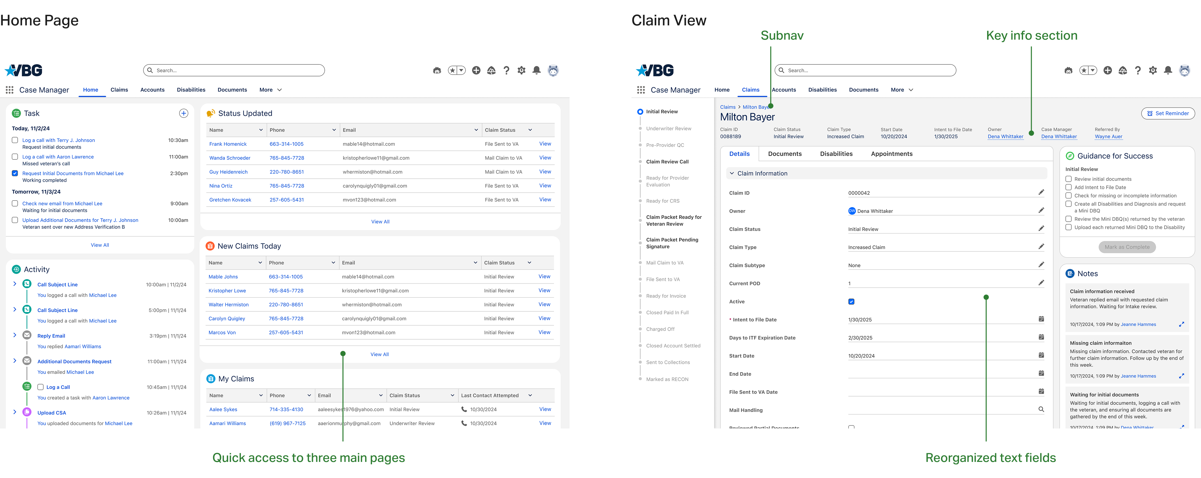
The sections were rearranged based on task priority. I removed low-usage features and replaced them with essential information, such as work progress and key updates. This allowed users to quickly view their main tasks without clicking into deeper pages.
Restructuring the information architecture
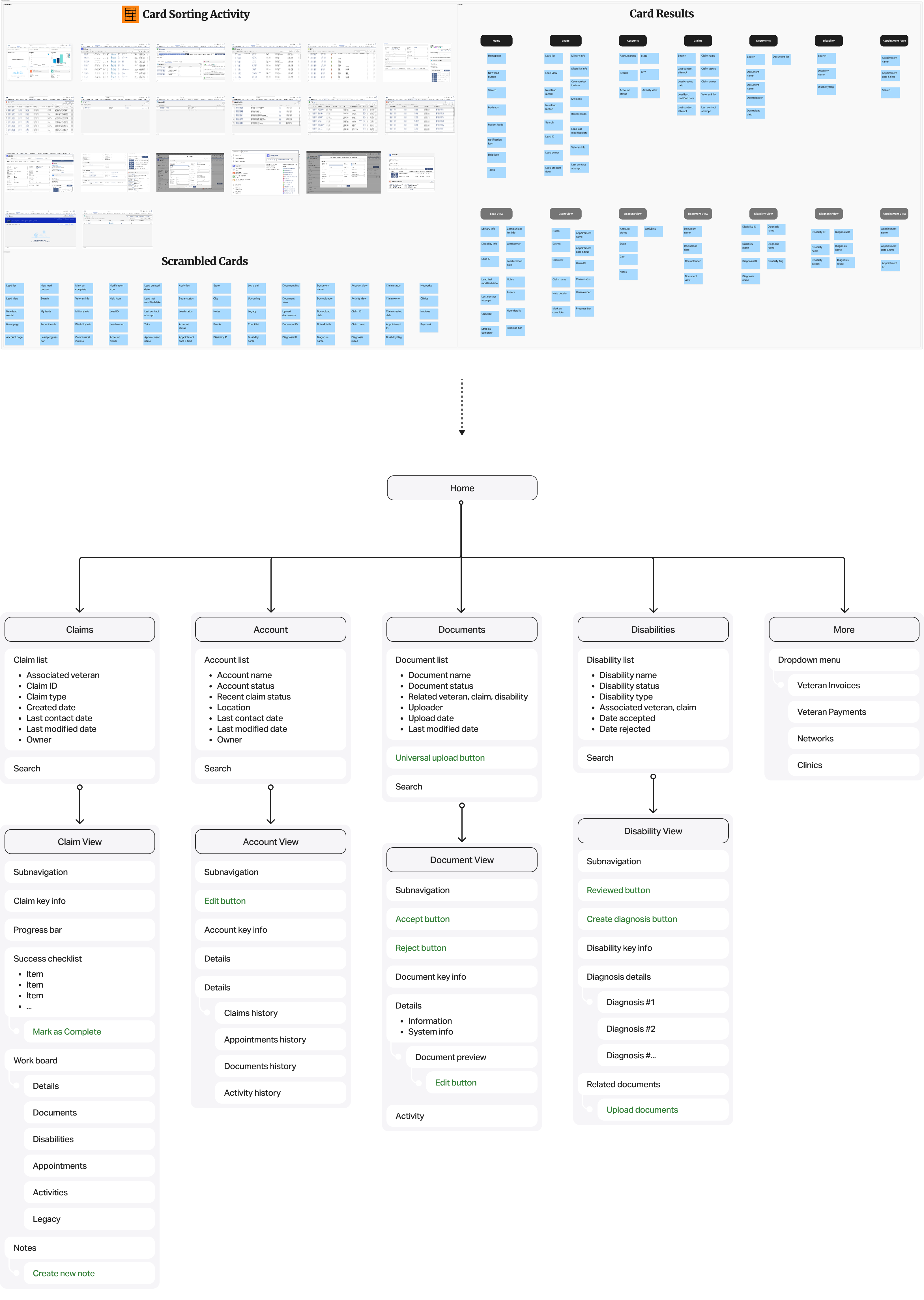
Card sorting
During user research, I mapped out all pages and features, then set up a virtual board in Figma with cards representing each page and feature. I asked participants from different roles to group, prioritize, and organize these cards based on their daily workflows. This exercise revealed how each role mentally grouped tasks — either by task type or frequency of use.
By analyzing these patterns, I identified common pain points and mental models, noticing differences in how roles organized content but also clear patterns of what needed to be surfaced. Based on these insights, I added missing but critical features users expected, reorganized categories around real workflows instead of arbitrary menus, and ensured key pages were always no more than one or two clicks away.
Improving discoverability
Home page enhancements
For the home page, I replaced unused entries with quick links to the top three most-used pages and added a preview of the latest claims so users could see updates at a glance. I also included a “View All” button for direct access to full pages, reducing menu navigation and saving time.
Task-focused field simplification
To simplify task-focused fields, I gathered role-specific needs from team leaders, removed unnecessary fields from forms, and clearly labeled only the required fields for each task, making the forms faster and easier to complete.
Clearer page differentiation
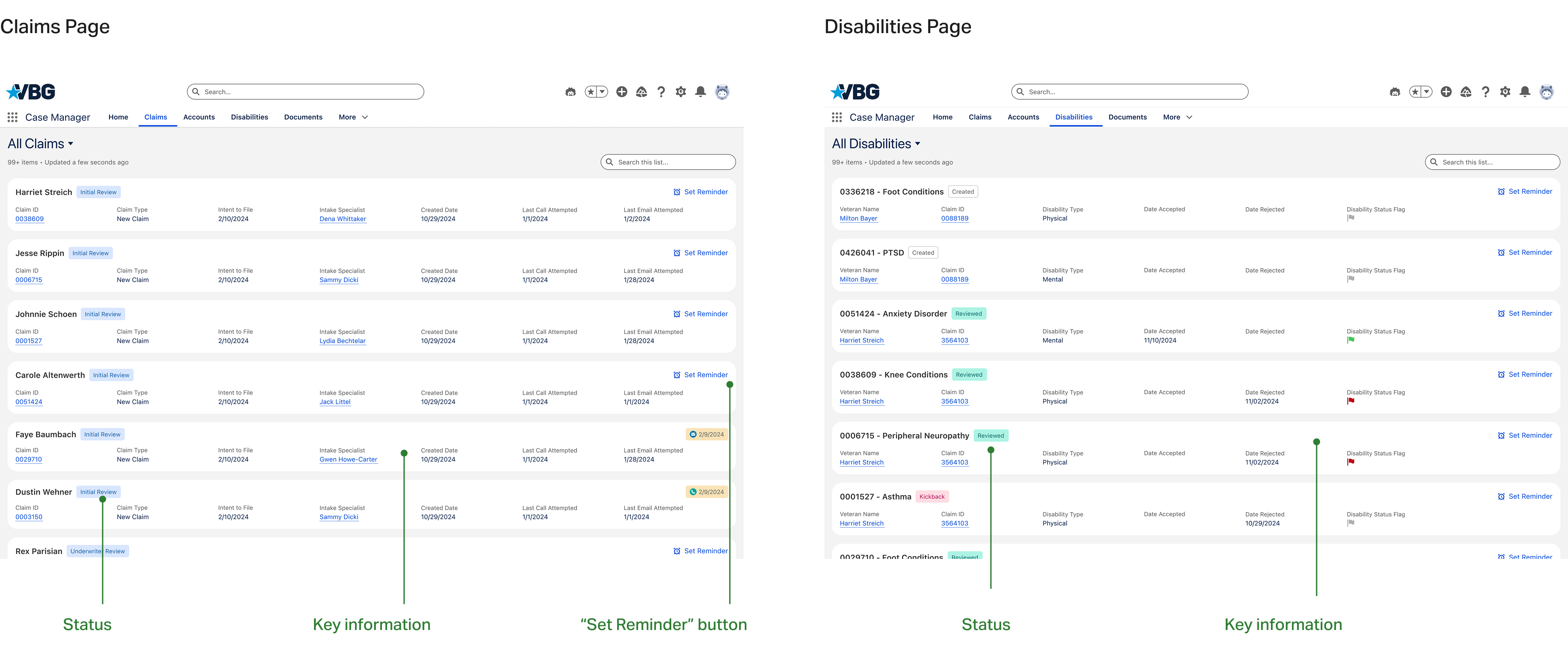
To improve page differentiation, I redesigned the Claims page and Disabilities page with card-based layouts, displaying key information directly on the cards to reduce unnecessary clicks.
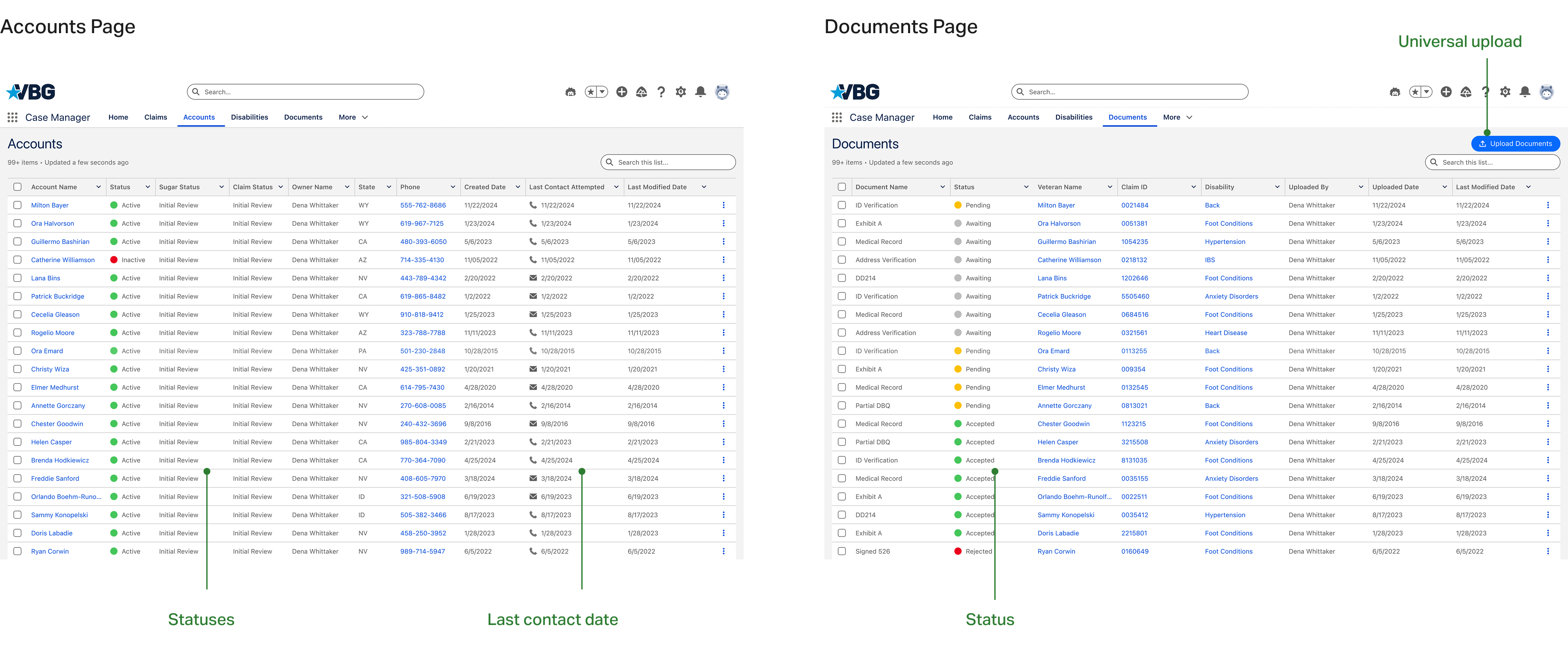
For Accounts page and Documents page, which handle larger datasets, I kept the table views but added important information columns to make content easier to scan and find.
Universal upload access
I added a universal document upload button on the Documents page, making file access easier, faster, and more consistent across the platform.
Measurable success
• Task completion time decreased as users no longer had to search through irrelevant information.
• Navigation errors dropped by 28.6%.
• The number of claim submissions doubled within one month after the new feature launch.
• User satisfaction scores (measured through post-update surveys) improved from 1.8 to 3.1 out of 5, with users specifically highlighting easier navigation and better access to key information.
Reflection
When designing for multiple user roles, a well-structured Information Architecture is critical. In this project, different roles had distinct tasks, but they all interacted within the same system. A poorly designed IA forced them to sift through irrelevant data, slowing down workflows and reducing productivity. A strong IA ensures that each user sees what matters to them, reduces cognitive load, and creates a seamless experience across different roles.