Digitizing the VBG Claim Process
Prodcut
Role
Year
At Veteran Benefits Guide, we help veterans file disability claims with the Veteran Affairs. The process is complex, and doing it alone often leads to low success rates. We support veterans by gathering documents, completing forms, conducting evaluations, and submitting claims. However, our manual, paper-heavy system can’t keep up with growing demand. Moving to a digital workflow is now essential to improve speed, scalability, and accuracy.
Sneak peak
Understanding the user
To understand user needs, I interviewed operation team members who work closely with veterans: Intake Specialists, Case Managers, Underwriters, and Case Review Specialists. I spoke with 2–3 people in each role and asked questions based on their part in the claims process. I also reviewed other industry products for ideas, such as insurance, healthcare, and tax preparation.
Key findings
• It took several days for veterans to gather documents. Even after submission, they were often asked for more files, causing delays.
• The Disability Benefits Questionnaires were confusing and difficult to complete. Veterans relied on case managers for help and often had to revise the questionnaires multiple times.
• Veterans couldn’t schedule or reschedule evaluations on their own. All changes had to go through the Network Support Coordinator Team, making the process slow and rigid.
• Veterans had no visibility into the status of their claims. The only option was to call customer service for updates.
Key challenges to solve
Challenge Ⅰ: Optimize the claim process
Challenge Ⅱ: Build a scalable dashboard template framework
Challenge Ⅲ: Design critical interactions for MVP
Challenge Ⅰ: Optimize the claim process
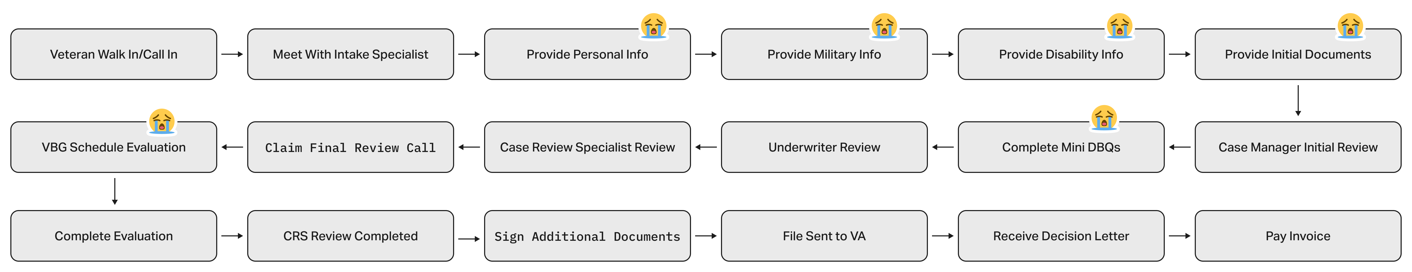
I mapped the full user journey to spot delays and frustration points. Key issues included:
• Redundant steps and separate veteran information collection.
• Heavy reliance on staff for Disability Benefits Questionnaire completion.
• Lack of claim progress transparency and control.
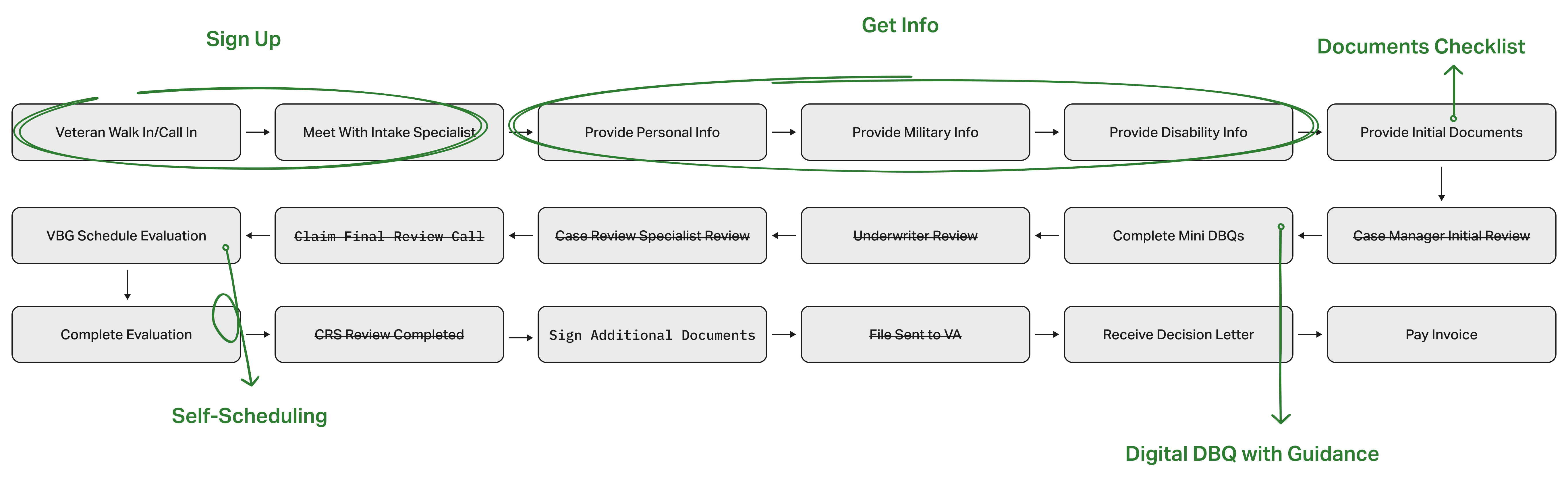
Transforming manual processes into digital solutions
1. Combined Information Collection
2. Disability Benefits Questionnaire with Guidance
3. Document Upload Checklist
4. Self-Service Scheduling
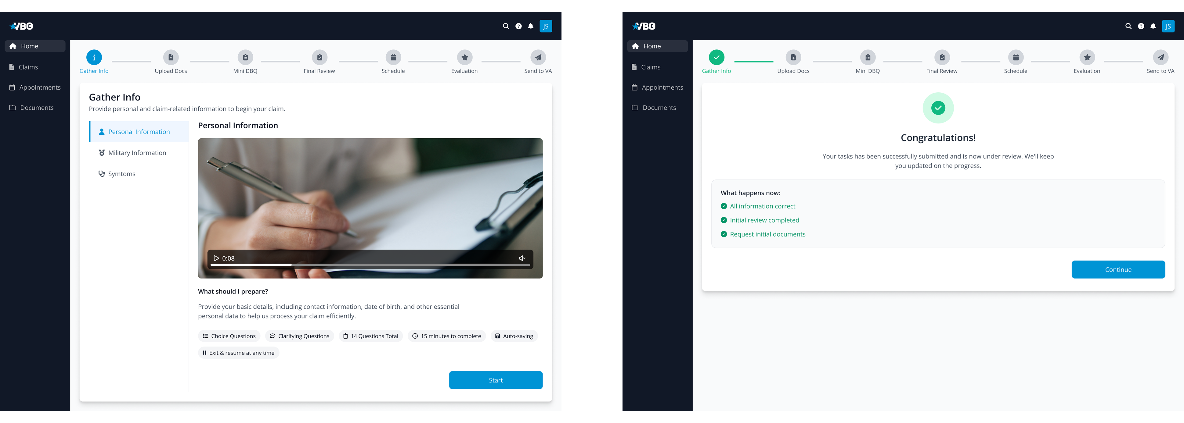
Digital claim process included 9 steps
Step 1: Sign Up
Step 2. Gather Info
Step 3. Upload Documents
Step 4. Complete Disability Benefits Questionnaires
Step 5. Schedule Evaluation
Step 6. Complete Evaluation
Step 7. Sign Packet
Step 8. Receive Decision Letter
Step 9: Pay Invoice
Challenge Ⅱ: Build a scalable dashboard template framework
With many steps and actions in the claim process, it was crucial to create a predictable, easy-to-follow structure. My design solutions focused on:
1. A universal layout for consistency
2. Reusable components for efficiency
Exploration Ⅰ: Task checklist with dashboard
This design shows all tasks in one place, giving users a complete overview. However, it can overwhelm them with too much information, take up excessive screen space, and cause confusion when tasks need to be completed in a specific order.
Exploration Ⅱ: Stepper + progress tracker in progressive disclosure
This approach breaks steps into smaller, manageable parts, helping users focus on one task at a time. But it has drawbacks — users can’t see the full process at a glance, and if one step contains too many tasks, the layout can become cluttered and overwhelming.

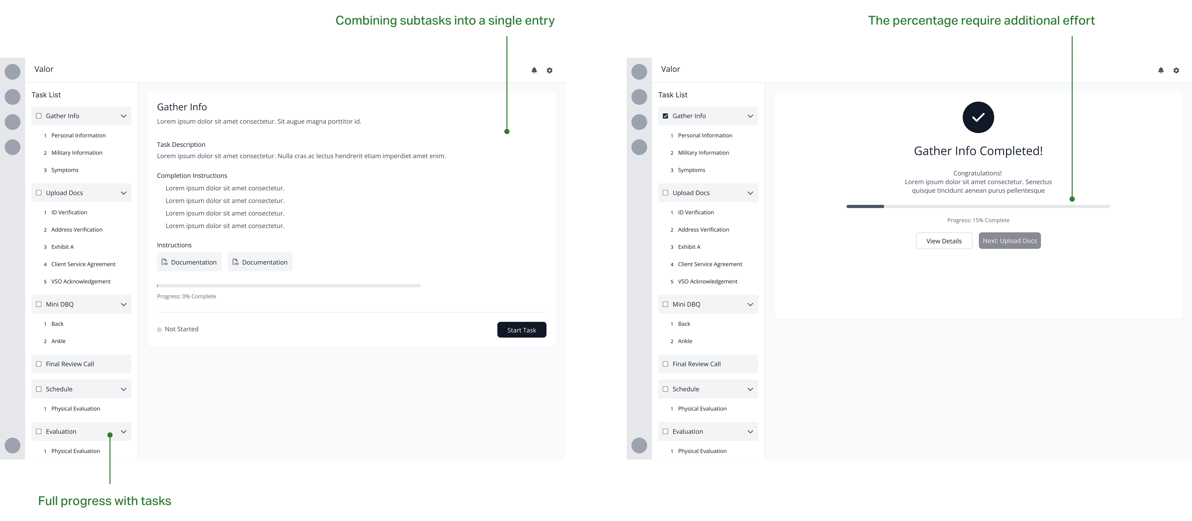
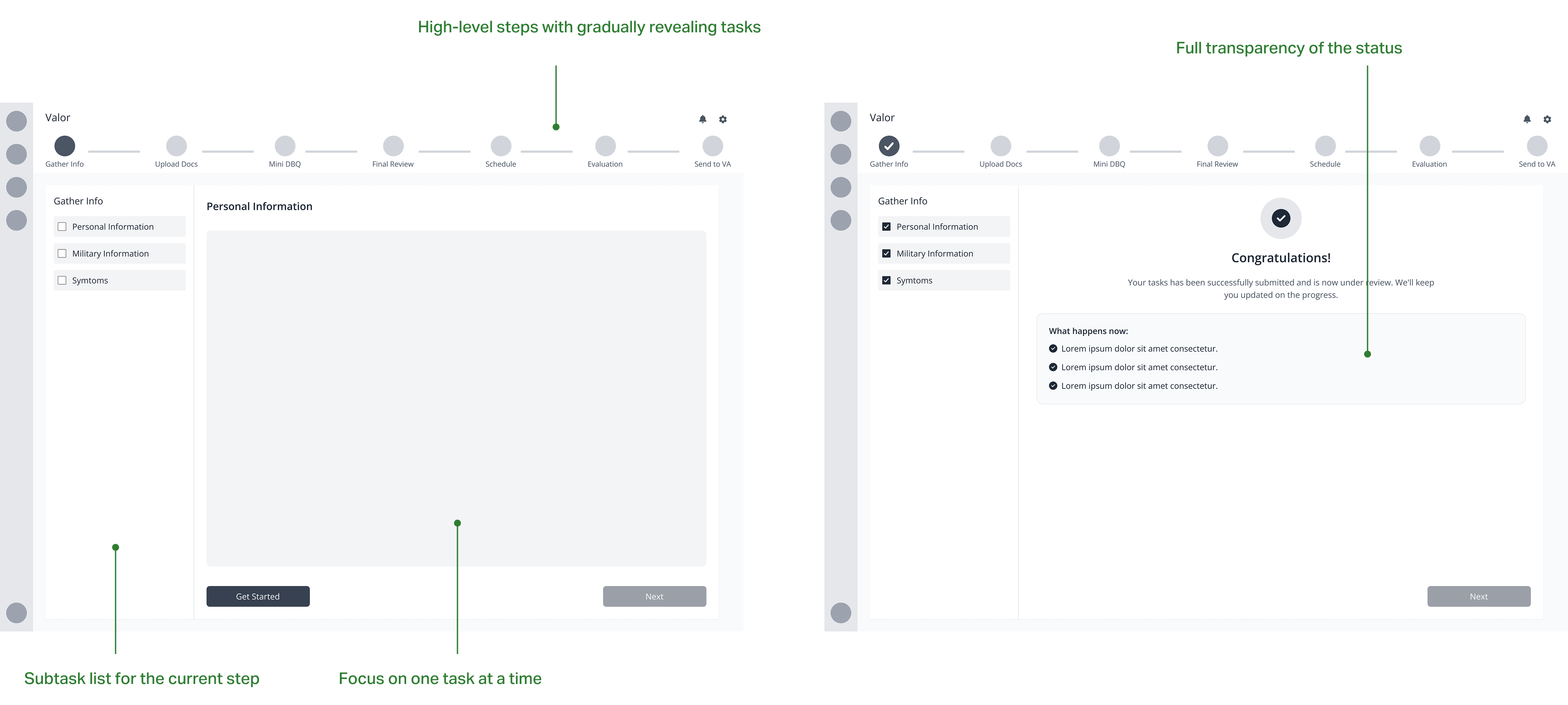
Final Solution: High-level stepper + vertical task checklist
This solution shows only the tasks for the current step, keeping users focused, while also providing a clear overview of the entire process broken down into simple steps. It uses progressive disclosure to reveal information as needed, reducing overwhelm, and prevents users from skipping critical steps, guiding them smoothly from start to finish.
Key interaction Ⅰ: Digitalized Disability Benefits Questionnaire
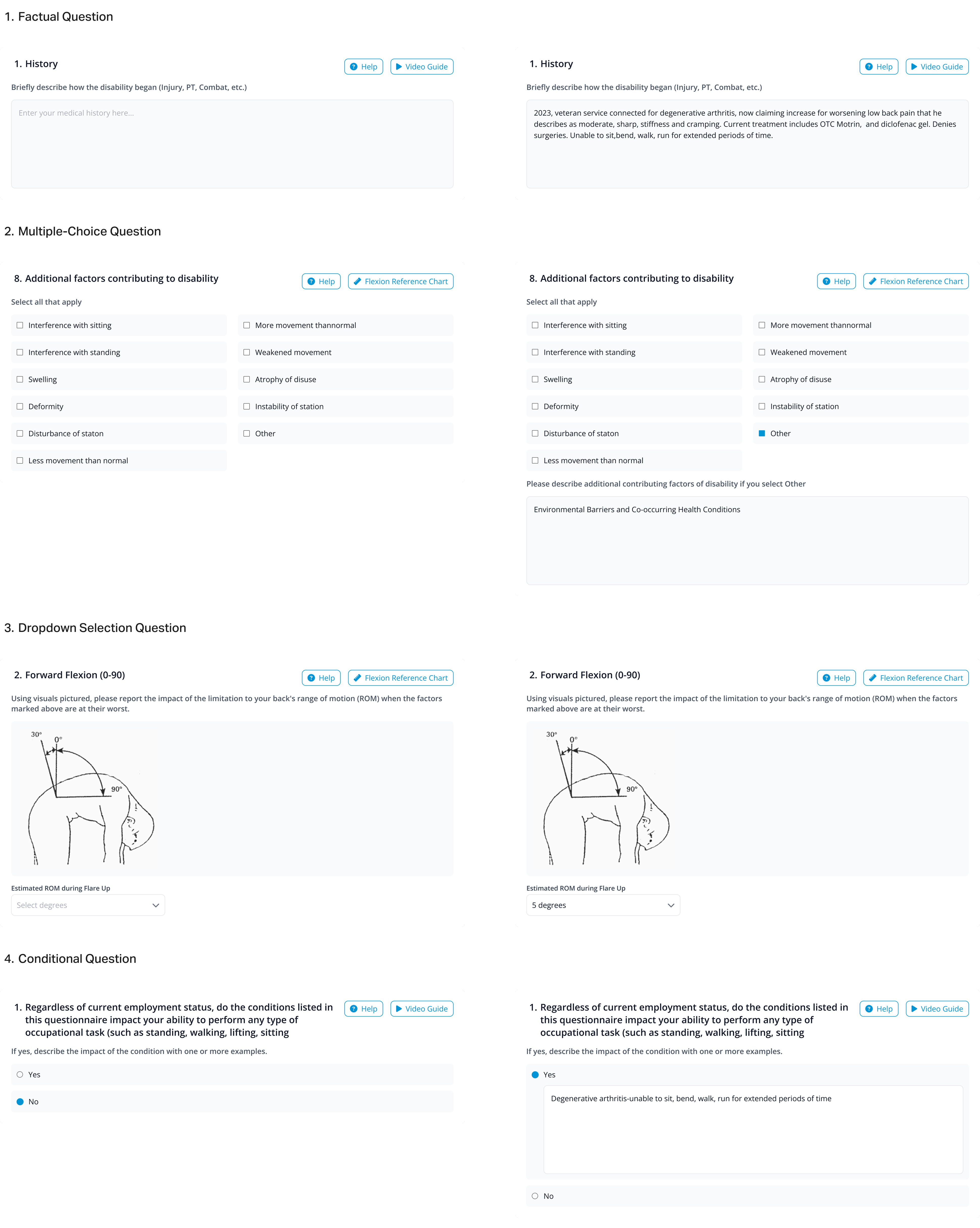
The Disability Benefits Questionnaire completion process is complex, with different forms for different disabilities. To handle this I worked closely with Medical Consultant to understand the logic and patterns behind these forms. Four common question types identified: 1. Factual Questions 2. Multiple-Choice Questions 3. Dropdown Selection Questions 4. Conditional Questions (follow-up questions based on answers).
Reusable components for efficiency
Reusable question cards that can be used for the multiple question types
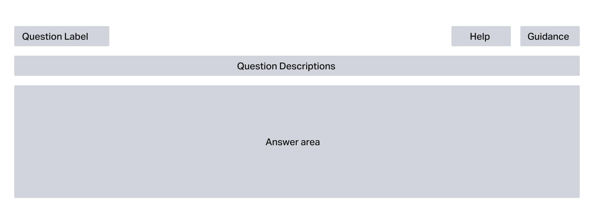
Question cards with difference status
Making it simple and visual
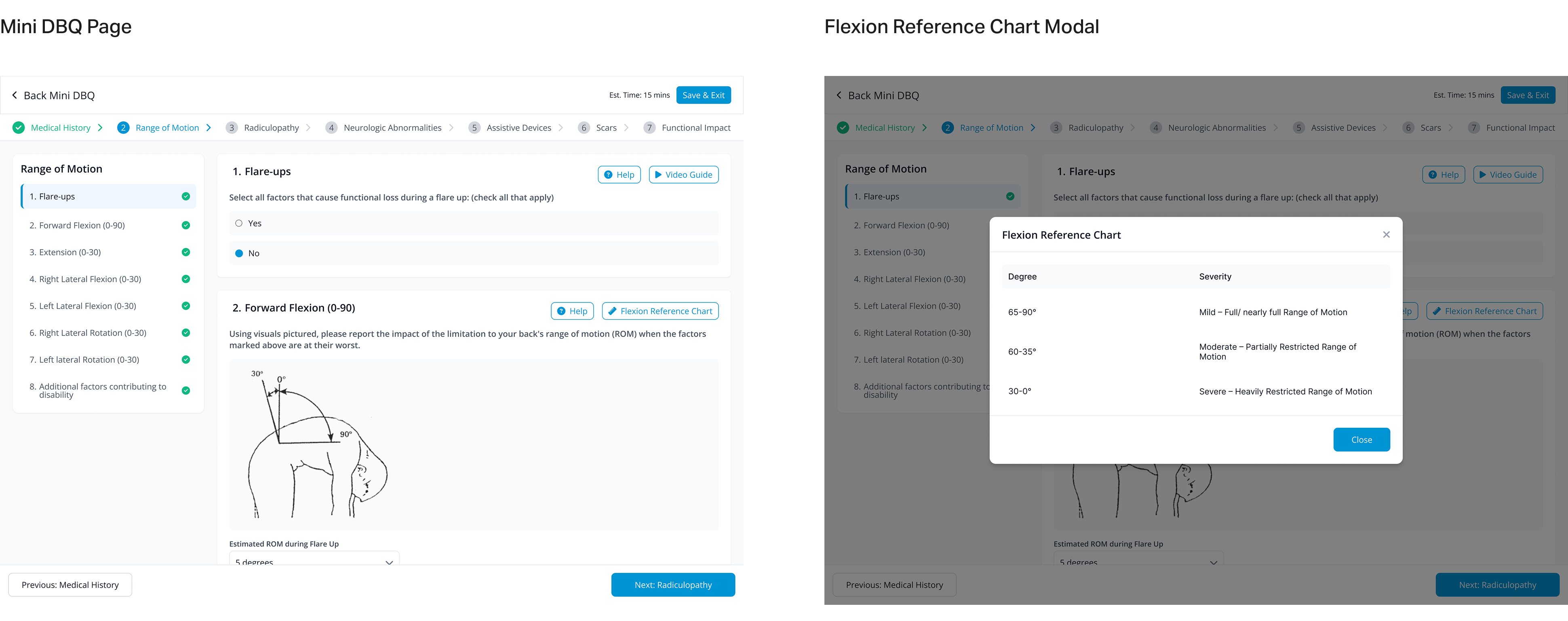
Some questions needed extra support. For example, in the Back Disability Benefits Questionnaire, veterans had to describe how far they could bend. Instead of using only text, I added visual illustrations for range of motion.
• The text explanations were still available, but hidden behind “Flexion Reference Chart” buttons.
• Veterans could tap to learn more if they needed extra details.
• This approach kept the form clean but still informative.
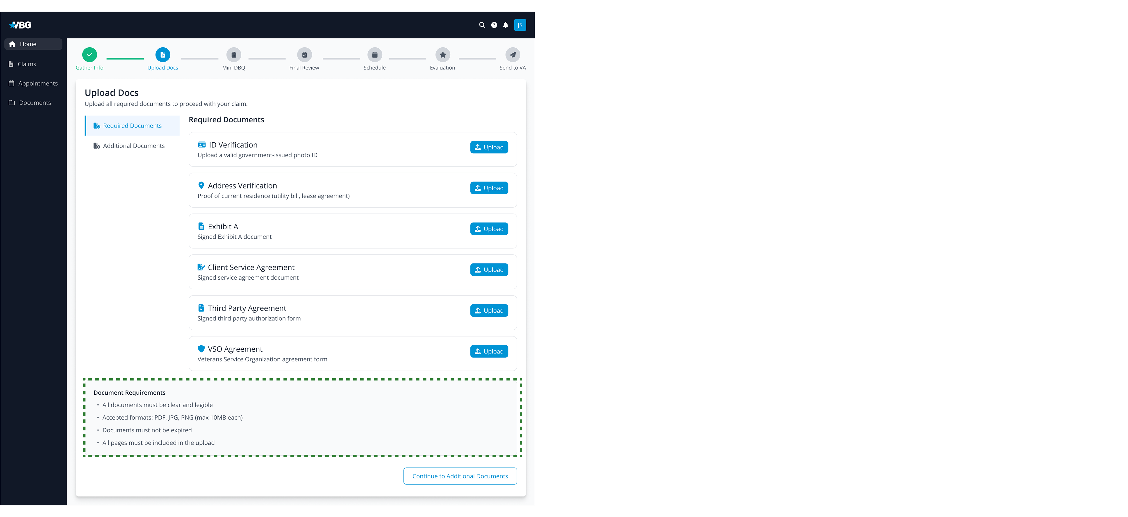
Key interaction Ⅱ: Document upload system
To avoid back and forth requesting documents, I wanted to make the document upload process simple, clear, and error-proof.
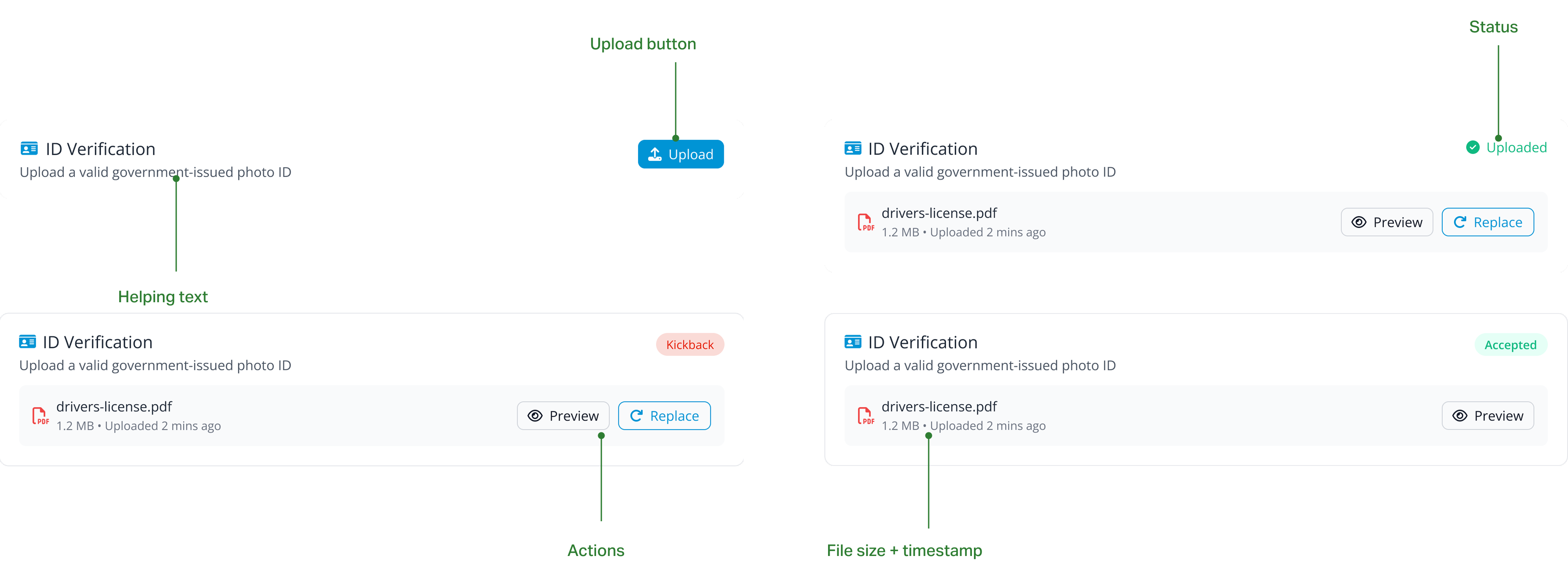
Document cards with status
Instead of a basic upload button, I designed Document Cards that show different statuses: Uploaded, Kickback, and Accepted.
Document requirements checklist
It is necessary to provide a clear ‘Document Requirements’ checklist. This helps veterans avoid uploading incorrect file types or expired documents, preventing delays.
Multi-file upload
In the upload modal, I included a multi-file upload feature, making it easier for veterans to submit multiple files at once. This speeds up the process and reduces frustration.

Feature Ⅲ: Self-service scheduling
Business restrictions
I aimed to give veterans full control over scheduling — letting them choose the network, clinic, and examiner, similar to common healthcare appointment systems.
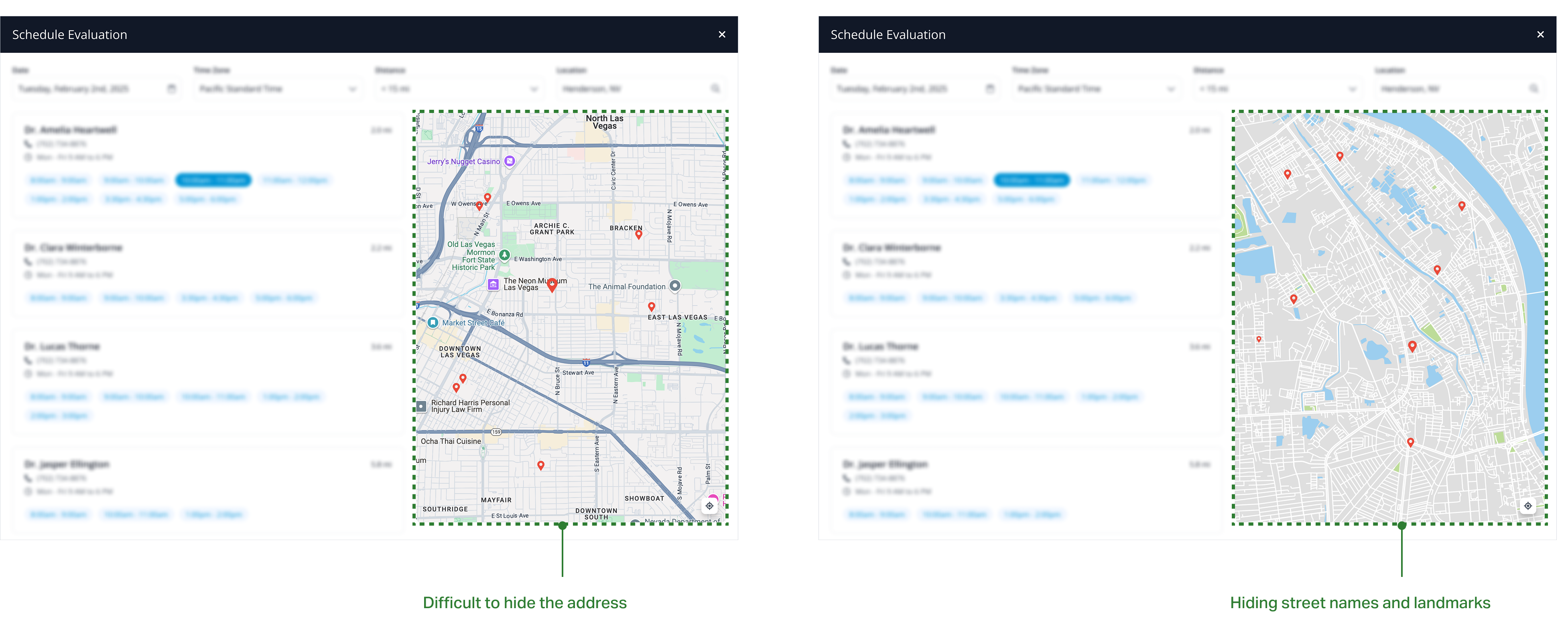
However, the business restrictions meant we couldn’t show certain details (like the network name, clinic name, or exact address). Allowing full visibility might have led veterans to book directly with examiners, bypassing the system and disrupting business partnerships. We needed to provide limited information so veterans could make confident decisions, but avoid revealing exact addresses.
Privacy-preserving map
After research and team discussions, I took inspiration from Airbnb’s map design:
• Used a simplified map showing basic terrain and major roads.
• Hid street names, landmarks, and precise locations.
• Displayed only the general area, helping veterans feel informed without breaking restrictions.
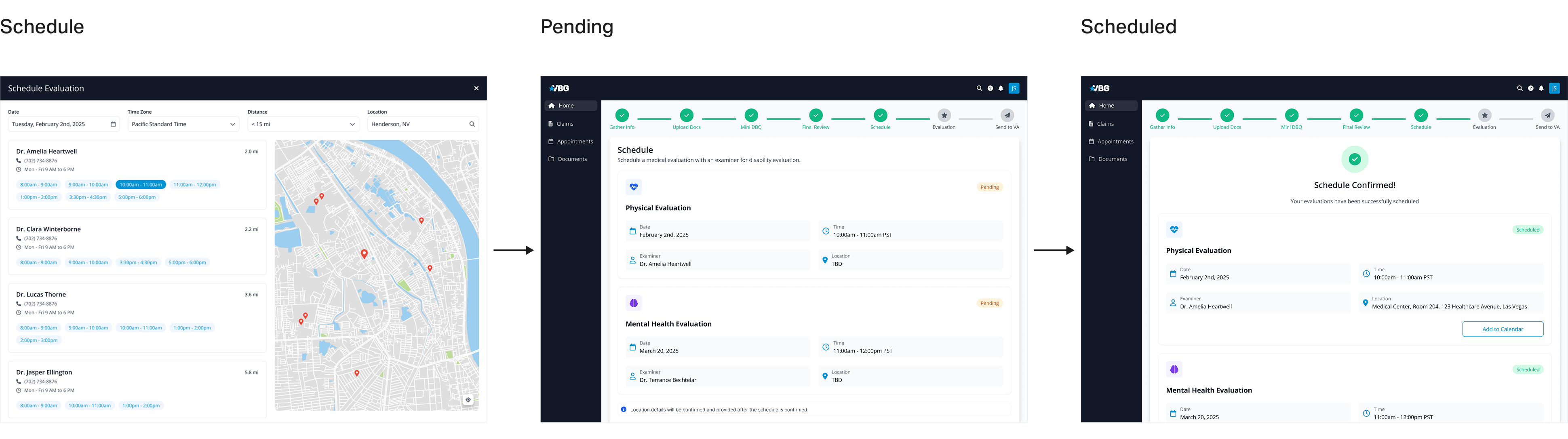
Scheduling flow
1. Veterans select and schedule an appointment.
2. The status shows as “Pending” — location marked as “TBD”.
3. Once the network confirms, the status updates to “Scheduled”, and the full address is revealed.
Design system
I built the design system from scratch, following the company’s branding and identity. I created reusable components like cards, input fields, and buttons to ensure consistency and efficiency.

Retrospection
Impact
• 48.6% reduction in overall claim processing time.
• 53.1% of veterans completed Disability Benefits Questionnaires without needing support, thanks to clearer forms and guidance.
• 49.2% decrease in customer service calls, as claim status tracking became self-service and transparent.
Key takeaways
Transforming the manual claim process into a digital system was both challenging and rewarding. User research drives meaningful change by informing scalable solutions, while balancing transparency with necessary restrictions ensures usability and security, all of which are strengthened through effective collaboration.